• Welcome to
     
    Your new HTML Template
    Aperture
     
    Modern & clean design
    CUSTOMIZABLE APPEARANCE
    AMAZINGLY FLEXIBLE
    Carefully handcrafted and designed with ease of use, functionality and flexibility in mind.
  • Welcome to
     
    Your new HTML Template
    Aperture
     
    Modern & clean design
    CUSTOMIZABLE APPEARANCE
    AMAZINGLY FLEXIBLE
    Carefully handcrafted and designed with ease of use, functionality and flexibility in mind.
For Every Device
Vivamus aliquam tellus nisi, tempus. Porttitor lectus laoreet semper etiam vestibulum.
Fast & Smooth
Vivamus aliquam tellus nisi, tempus. Porttitor lectus laoreet semper etiam vestibulum.
Lots of Features
Vivamus aliquam tellus nisi, tempus. Porttitor lectus laoreet semper etiam vestibulum.
Customer Support
Vivamus aliquam tellus nisi, tempus. Porttitor lectus laoreet semper etiam vestibulum.

Aperture can be different

Full Featured template for any website

Aperture is a powerful and fun to work with premium HTML Template. Carefully handcrafted and designed with ease of use, functionality and flexibility in mind. Take a moment to explore its features on this live preview demo website.
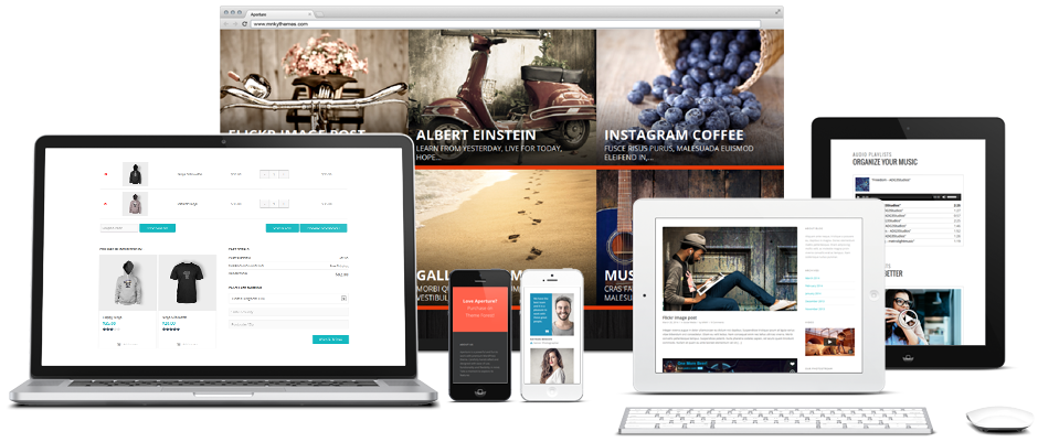
first-mockup
Rock solid code.
You can rely on the code inside and always be ready for latest WordPress updates. Our template is built using best practices and modern web techniques to ensure smooth usage process.
Rock solid code.
You can rely on the code inside and always be ready for latest WordPress updates. Our template is built using best practices and modern web techniques to ensure smooth usage process.

Feel the difference

High definition ready

Aperture uses various techniques to make template look sharp and crisp on high definition and retina devices. In addition, iconic font with beautiful icon panel will make the creation process easy and fun. The goal is to ensure pleasant browsing experience on modern screens – no more blurred logos or crunched icons.
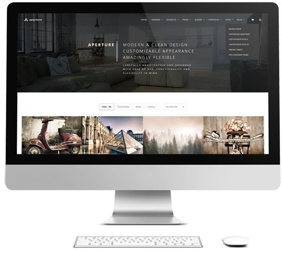
desktop_mockup2
Modern and clean design
Slider Revolution integration
Mobile ready out of the box
Powerful portfolio builder
Automatic photo gallery
Customizable headers
For business and creative folks
Multiple header style choices
Section menu for any page
Full width content option
Ready for translation
WooCommerce shop
Various media type support
Post format based blog
Drag & Drop builder interface
Comprehensive template options
Integration for included plugins
Dedicated support & community
mobile_mockup_1

Responsive design

Browse website from any device
Responsive & Retina
Alia melius menandri dolorem viverra tempor eripuit ex sit vis sodales natum leo urna risus lobortis nulla ligula varius vitae.
Fully Flexible Content
Alia melius menandri dolorem viverra tempor eripuit ex sit vis sodales natum leo urna risus lobortis nulla ligula varius vitae.
Special Mobile Options
Alia melius menandri dolorem viverra tempor eripuit ex sit vis sodales natum leo urna risus lobortis nulla ligula varius vitae.
Mobile Ready Out of The Box
Alia melius menandri dolorem viverra tempor eripuit ex sit vis sodales natum leo urna risus lobortis nulla ligula varius vitae.

Still not sure?See more below

0

DAYS OF HARD WORK

0

HAPPY CLIENTS

0

COFFEE CUPS A WEEK

0

STAR QUALITY

Our friendly team

The group of smiling people

This is one of the ready styled elements of Aperture template. Lots of elements are available in super simple drag&drop visual composer with even more elements to come. Just add and arrange elements to create the page – it’s that simple.

Working for the best agency is an amazing experience. Just love my job!
Amanda Roberts

Web Designer

We have the best team, and it is a pleasure to work with these great people.
Nathan Benson

Creative Director

I love the agency I am working for and wouldn’t want it any different.
John Doe

Senior Developer

Browsing experience.
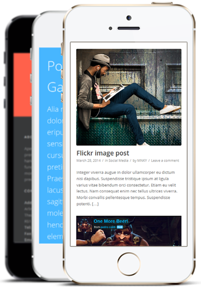
Aperture is completely ready for mobile and tablet browsing. High resolution graphics and responsive layout makes template look great on any device and screen size.
Browsing experience.
Aperture is completely ready for mobile and tablet browsing. High resolution graphics and responsive layout makes template look great on any device and screen size.
Responsive & Retina
Alia melius menandri dolorem harum tempor eripuit ex sit, vis natum sensibus expetendis.
Powerful Backend
Alia melius menandri dolorem harum tempor eripuit ex sit, vis natum sensibus expetendis.
Constant Updates
Alia melius menandri dolorem harum tempor eripuit ex sit, vis natum sensibus expetendis.
Customer Support
Alia melius menandri dolorem harum tempor eripuit ex sit, vis natum sensibus expetendis.
Unlimted Colors
Alia melius menandri dolorem harum tempor eripuit ex sit, vis natum sensibus expetendis.
Great Flexibility
Alia melius menandri dolorem harum tempor eripuit ex sit, vis natum sensibus expetendis.
Lots of Features
Alia melius menandri dolorem harum tempor eripuit ex sit, vis natum sensibus expetendis.
Portfolios and Galleries
Alia melius menandri dolorem harum tempor eripuit ex sit, vis natum sensibus expetendis.
Created With Love
Alia melius menandri dolorem harum tempor eripuit ex sit, vis natum sensibus expetendis.

After you have typed in some text, hit ENTER to start searching...