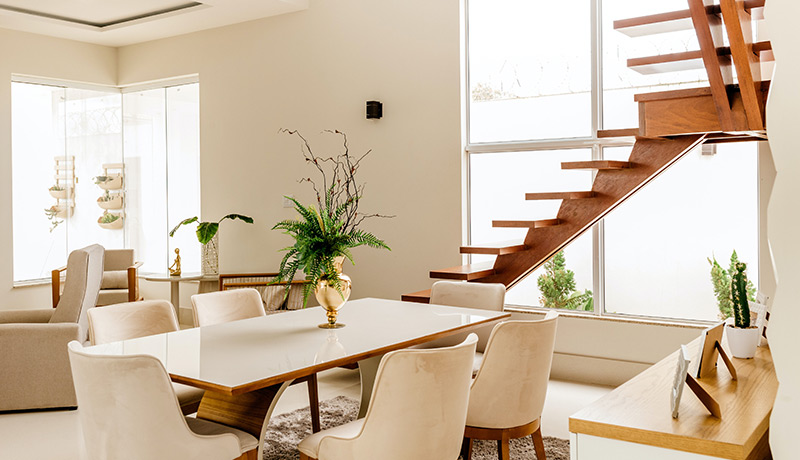
Clean lines,reductive,uncluttered,monochromatic,simplicity,"less is more"—these are some of the terms and concepts that immediately come to mind when thinking about minimalism. It's impossible to deny the serenity and simple beauty when confronted with a resolved minimalist interior, but achieving this look is more deliberate and frankly, difficult, than just choosing a few pieces of furniture for a white backdrop, which can leave a space feeling cold, sparse and unlived-in. Take a look at our guide below, crafted from conversations with three interior designers and two architects well-versed in designing simply stunning minimalist interiors; learn what the concept of minimalism is to them and how they have achieved form-focused interiors for their clients.
A minimalist-designed space incorporates an open floor plan, lots of light, and simple line furnishings that are well-built and comfortable. All these create a soothing and inviting space that has a timeless aesthetic.
Minimalism for me is about keeping a space simple, uncluttered and accentuating the attractive architectural features of a space. The palette is mostly monochromatic and color is used as an accent
You still need all of the items in a space for it to function, but in minimalist decor, 'form' is very important. For example, in a dining room, you need a table and chairs. These pieces need to speak to one another and relate in regards to things like line, color, mass, etc. They must work well together in their basic shape.
In a minimalist condominium living room designed by Brown and his team, he says, "All of the furniture was purposeful—chairs to comfortably sit in, tables for drinks, hidden window treatments to allow views from this high-story residence, a fireplace to warm. Even the art is simple in composition. The clients have extremely active lives and need their home to be restful, not stimulating to the eye."


Comments