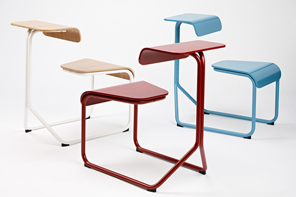
Card title
Some quick example text to build on the card title and make up the bulk of the card's content.
Go somewhere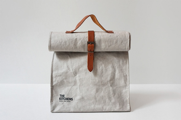
Card title
Some quick example text to build on the card title and make up the bulk of the card's content.
Go somewhereCard title
Support card subtitle
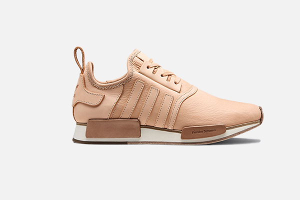
Some quick example text to build on the card title and make up.
Card linkAnother linkContent Types
Cards support a wide variety of content, including images, text, list groups, links, and more. Below are examples of what’s supported.
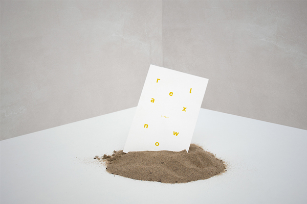
Card title
This is a wider card with supporting text below as a natural lead-in to additional content. This content is a little bit longer.
Last updated 3 mins ago
Card title
This is a wider card with supporting text below as a natural lead-in to additional content. This content is a little bit longer.
Last updated 3 mins ago

Video Embed
Support card subtitle
Some quick example text to build on the card title and make up the bulk of the card's content.
Card linkAnother linkList Group
Some quick example text to build on the card title and make up the bulk of the card's content.
- Dapibus ac facilisis in
- Cras justo odio
- Vestibulum at eros
- Dapibus ac facilisis in
Text Alignment
You can quickly change the text alignment of any card—in its entirety or specific parts—with our text align classes .text-center .text-right
Special title treatment
With supporting text below as a natural lead-in to additional content.
Go somewhereSpecial title treatment
With supporting text below as a natural lead-in to additional content.
Go somewhereSpecial title treatment
With supporting text below as a natural lead-in to additional content.
Go somewhereImage overlays
Turn an image into a card background and overlay your card’s text. Depending on the image, you may or may not need .card-inverse (see below).


Card Decks
Need a set of equal width and height cards that aren’t attached to one another? Use card decks.

Card title
This is a longer card with supporting text below as a natural lead-in to additional content. This content is a little bit longer.

Card title
This card has supporting text below as a natural lead-in to additional content.
Card title
This is a wider card with supporting text below as a natural lead-in to additional content. This card has even longer content than the first to show that equal height action.
Background variants
Cards include their own variant classes for quickly changing the background-color and border-color of a card. Darker colors require the use of .card-inverse.
Lorem ipsum dolor sit amet, consectetur adipiscing elit. Integer posuere erat a ante.
Lorem ipsum dolor sit amet, consectetur adipiscing elit. Integer posuere erat a ante.
Lorem ipsum dolor sit amet, consectetur adipiscing elit. Integer posuere erat a ante.
Lorem ipsum dolor sit amet, consectetur adipiscing elit. Integer posuere erat a ante.
Lorem ipsum dolor sit amet, consectetur adipiscing elit. Integer posuere erat a ante.
Lorem ipsum dolor sit amet, consectetur adipiscing elit. Integer posuere erat a ante.
Cards Groups
Use card groups to render cards as a single, attached element with equal width and height columns. Card groups use display: flex; to achieve their uniform sizing.

Card title
This is a wider card with supporting text below as a natural lead-in to additional content. This content is a little bit longer.
Last updated 3 mins ago

Card title
This card has supporting text below as a natural lead-in to additional content.
Last updated 3 mins ago

Card title
This is a wider card with supporting text below as a natural lead-in to additional content. This card has even longer content than the first to show that equal height action.
Last updated 3 mins ago
Card columns
Cards can be organized into Masonry-like columns with just CSS by wrapping them in .card-columns . Cards are built with CSS column properties instead of flexbox for easier alignment. Cards are ordered from top to bottom and left to right.
Heads up!Your mileage with card columns may vary. To prevent cards breaking across columns, we must set them to display: inline-block as column-break-inside: avoid isn’t a bulletproof solution yet.

Card title that wraps to a new line
This is a longer card with supporting text below as a natural lead-in to additional content. This content is a little bit longer.
Lorem ipsum dolor sit amet, consectetur adipiscing elit. Integer posuere erat a ante.

Card title
This card has supporting text below as a natural lead-in to additional content.
Last updated 3 mins ago
Lorem ipsum dolor sit amet, consectetur adipiscing elit. Integer posuere erat.
Card title
This card has supporting text below as a natural lead-in to additional content.
Last updated 3 mins ago

Lorem ipsum dolor sit amet, consectetur adipiscing elit. Integer posuere erat a ante.
Card title
This is a wider card with supporting text below as a natural lead-in to additional content. This card has even longer content than the first to show that equal height action.
Last updated 3 mins ago


