Flyby
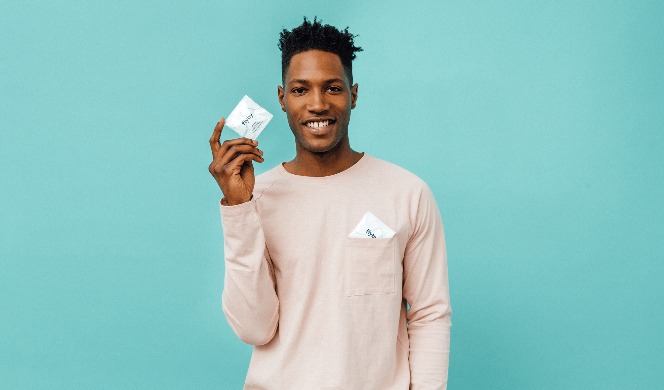
Flyby is a company on a journey. As one of America’s newest, most unique start-up brands, it’s steadily building a devoted community of folk who don’t have time for hangovers. Our challenge was to create a brand that brings to life their vision of drinking smarter and living better.
- Branding

Flyby Your Hangover
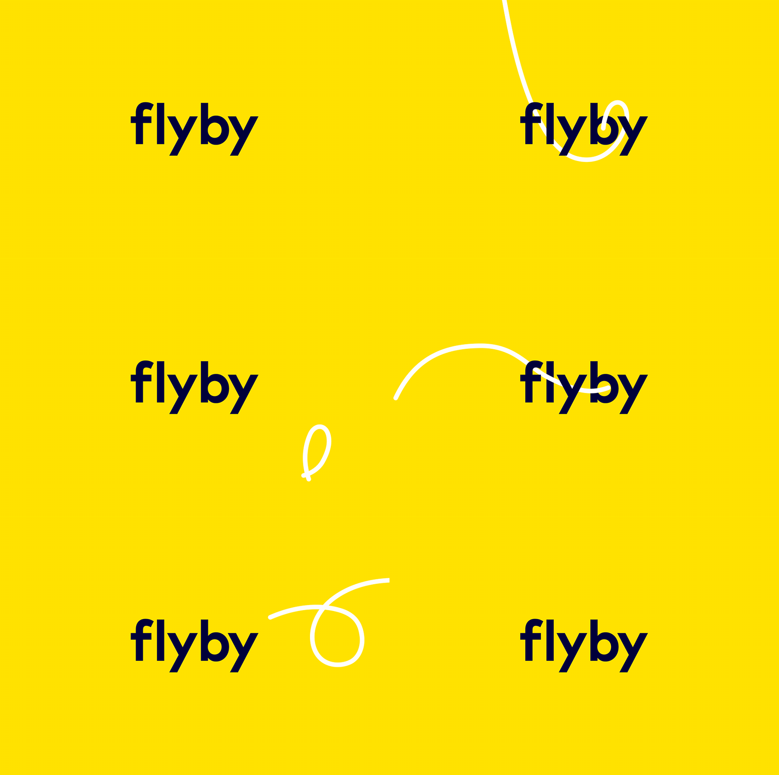
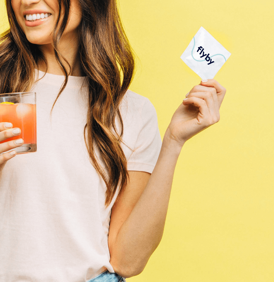
Inspired by the name of the product, we created the Flyby 'loop' as a visual representation of the product and how it allows you to 'fly by your hangover'. The loop is infinitely adaptable to its surroundings; be that the brand logo, typography, imagery or iconography and provides a flexible brand asset that is instantly identifiable to the Flyby brand. With help from James Huson, we developed an animation style to bring a life of it's own to the loop device.


A Punchy Personality
We played heavily on the name of the product and connected it to real life 'hangover' situations in order to bring personality and a friendly, realistic tone to a market that can otherwise be quite dull and boring.
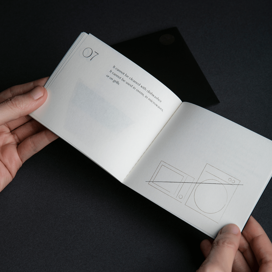
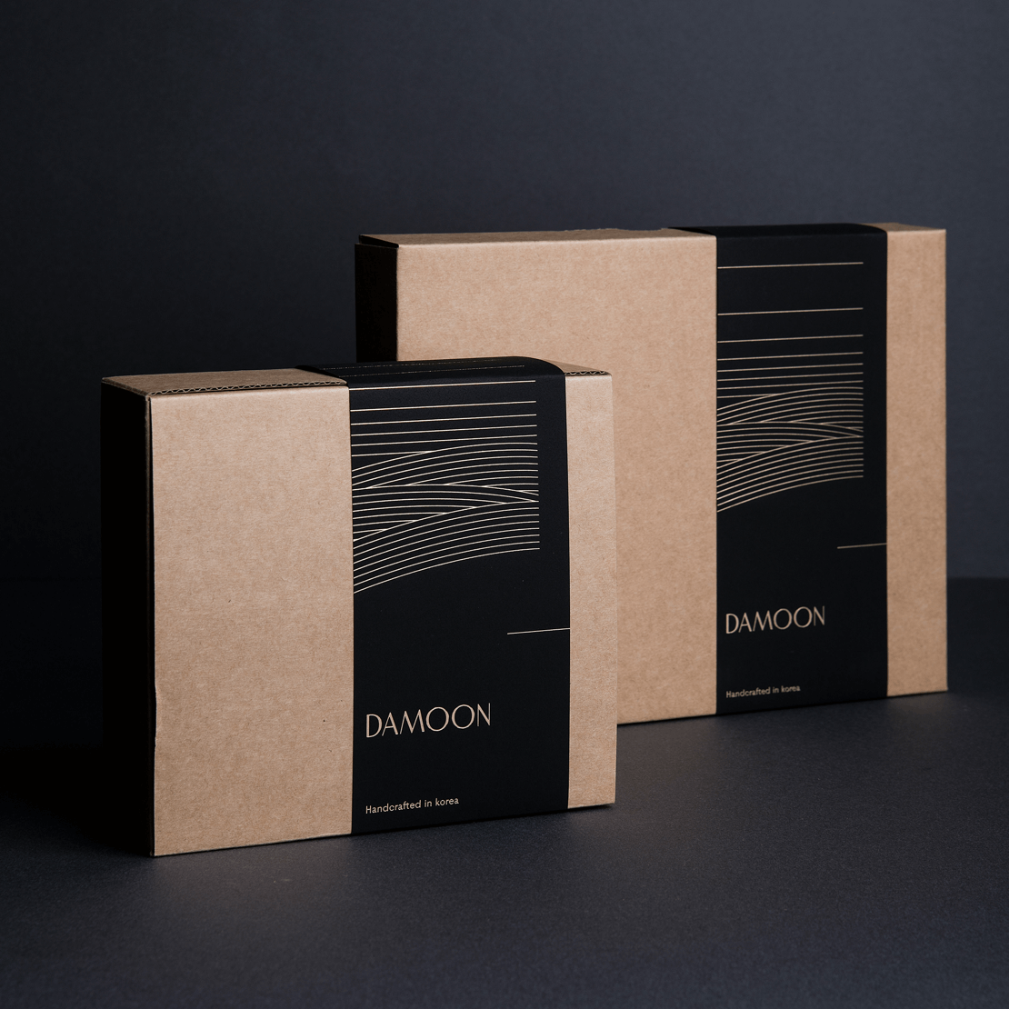
The new Flyby identity is simple, welcoming and memorable — like the product itself, the brand is a direct challenge to a category that is generally boring and full of jargon.

The Result
We created a comprehensive set of guidelines to help Flyby bring the brand to life across all channels. But we continue to work closely together, developing their internal and external communications.
